Image

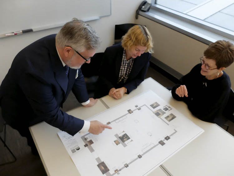
Virtually Installed, From left: Harrison, Korkow, and Wieseman peruse a gallery plan for the reinstalled British galleries this past September.
Early next year, the British galleries (203a-b) will close for reinstallation for the first time since 2008, when the upper floor of the renovated 1916 building opened. The three curators overseeing these collections—Betsy Wieseman, chair of European art from classical antiquity to 1800 and Paul J. and Edith Ingalls Vignos Jr. curator of European paintings and sculpture, 1500–1800; Cory Korkow, associate curator of European paintings and sculpture, 1500–1800; and Stephen Harrison, curator of decorative art and design—recently discussed the project and its goals.
Betsy Wieseman The reinstallation of the British galleries allows visitors to encounter some old favorites in a new context—for example, the Portrait of the Ladies Amabel and Mary Jemima Yorke by Joshua Reynolds between the pair of recently acquired Chippendale candlestands. In effect, you’ll experience the painting in three dimensions with furnishings, much like someone would have seen it originally.
Cory Korkow More than a dozen additional paintings and sculptures—recent acquisitions, gifts, and works that haven’t been on view for decades—provide a much more holistic approach to displaying British art. Plus, we’re bringing in works from other galleries.
Stephen Harrison The addition of decorative arts and furniture acquired over the past 10 years allows us to tell a story that we weren’t able to tell before. For example, our settee by Thomas Hope from around 1802 used to be shown in the neoclassical gallery because at the time it was really our only example of British neoclassicism, and I didn’t want it to live all on its own in the British galleries. By placing it near the somewhat earlier Chippendale candlestands, we can now present a dialogue between late 18th-century and early 19th-century neoclassicism.
BW A wonderful aspect of this installation is that the settee will be in the background when you’re in front of the candlestands, so you can see them in the same eyeful. We should point out that the settee has been reupholstered. A remnant of the original upholstery was still adhered to the back side of the frame, so we were able to have fabric specially woven and dyed to match that, and it’s just glorious.
SH Whether you approach the newly reinstalled space from the American colonial gallery or from the neoclassical gallery, there are large, imposing works that will draw you in. When you look back into the British galleries from the American colonial gallery, for example, the first thing you see is Turner’s Burning of the Houses of Lords and Commons, which is . . . kind of a nice touch. [A bit of curatorial humor!]
CK The view that I’m most excited about has two monumental paintings flanking the central mantel on the west wall, one of which is Thomas Gainsborough’s magnificent Portrait of George Pitt, First Lord Rivers. It hasn’t been on view for decades because of a condition issue that our conservators have now remedied.
SH The mantel is about the only thing that has remained stationary. Everything else has moved around it.
CK That’s true. For example, we shifted the central wall back and away from the mantel, creating space for a truly impressive, grand installation, like you would see in an English country house.
SH At the east end we removed the bulky cases, helping us to concentrate on our collection of British ceramics and silver. In the previous installation, American colonial and British silver weremixed to show the influence of the latter, almost as a prelude to the American colonial gallery. Now we’re focusing specifically on British silver, and we’ll be reinstalling the American silver objects in their respective galleries, codifying the importance of decorative arts in the interior scheme of a country house.
CK Speaking of which, the British galleries’ color scheme is also changing.
SH The wall color will be perhaps the most noticeable change to visitors. We’ve moved away from an earlier color that was chosen to be sympathetic to certain pictures but was not historically accurate.
CK We’re fine-tuning a color called green verditer, a light blue-green often found in 18th-century rooms.
BW What I love about this current reinstallation is that when Stephen and I worked on the northern European galleries last year, he (as a decorative art and design scholar) identified the appropriate wall colors, but in this instance it was Cory who came up with the suggestion. We have flexible roles in reinstallation projects.
SH Exactly. This has truly been a collegial effort, and it’s indicative of curatorial teamwork throughout the galleries. When the galleries were installed a decade ago, the staff dedicated itself to integrated installations of decorative arts with painting and sculpture, a methodology that provides visitors with the context of a particular time and place when all these different genres of art were being produced.
BW That approach creates a much richer environment.
CK From my perspective, installing paintings and sculpture alongside decorative arts enhances the visitor’s experience, helping them to understand all the works in historical context. That resonance makes them even more beautiful.
BW We’ve also benefited from discussions with our colleagues in the interpretation department to help us most effectively communicate insights and information—like why artworks are arranged in a particular way.

SH One work I hope visitors will see anew is the extraordinary Hen and Chicks Tureen and Stand by the Chelsea Porcelain Factory, which will have its own display case in an area that links it visually with a landscape and hopefully a painting depicting a beloved animal, because its intended context derives from that great era of animal husbandry and the like—very much a gentlemanly pursuit. To see that work now in the context of country-house living and collecting tells a much stronger story.
To complement the Chippendale candlestands, we have acquired the rare French version of Thomas Chippendale’s massive book [more than 300 pages] of 18th-century design. Chippendale had hoped that publishing the book in French would help his designs catch on in Europe. In the end, they were most popular in America, where they greatly influenced colonial furniture.

CK When I began working on this project, I thought about it from the perspective of bringing my family and friends into the gallery. What’s the first thing I would take them to see? That’s Augustus Egg’s The Life of Buckingham, a quirky mid-19th-century history painting of the notorious 17th-century Duke of Buckingham dining at the court of King Charles II. The duke was a wicked man who met an untimely end, and Victorians loved a cautionary tale! The picture is full of gorgeous details and shows how the Victorians embraced the past even in their age of electricity and steamships. It helped them feel rooted in a time of tremendous change. And it’s an exquisitely painted jewel of a picture.
I’m also thrilled to have the miniatures cabinet back, as these tiny works have been off view since 2013. We have one of the best collections of British portrait miniatures in the country, if not the world. They will rotate every six months, so visitors can open the cabinet and expect to see a new set of faces that address a theme in British art.

BW The recent acquisition Portrait of Colonel Charles Heathcote by Joseph Wright of Derby hasn’t yet been on view because there just wasn’t a place for it in the former installation. It shows the artist, who started his career as a portrait painter, right at the moment when he’s discovering landscape. There’s a delightful contrast between the detail and the fineness that he lavishes on the portrait, where you can practically see the stitches around the buttonholes, and the much more impressionistic, thickly painted landscape. It’s fascinating not only in terms of its subject matter—a man in military costume in this beautiful English landscape—but also in terms of its technique.
Two objects that have been in the collection for a long time will be shown in a lovely new juxtaposition: Benjamin West’s painting of the Wedgwood pottery factory and the iconic Portland Vase that was produced there. Displaying these objects in proximity helps visitors to understand the fascination with classicism and antiquity in late 18th- and early 19th-century England. They speak so beautifully to each other and exemplify the aim of the British galleries.
Cleveland Art, November/December 2019